Data visualization guide
33 Types of Charts and Graphs: Examples and When to Use Each
Choose a chart by the question you need to answer—not by which one looks the most impressive. This guide compares 33 chart and graph types, explains when each works, and links directly to a free maker.
The short answer
Use a bar chart to compare categories, a line graph for change over time, a histogram for a distribution, a scatter plot for relationships, and a pie chart only for a simple part-to-whole story. When in doubt, choose the simplest chart that makes the answer obvious.
Create a chart with AIWhich chart should you use?
Start with the analytical question. The chart family usually follows from it.
| What do you need to show? | Start with | Other useful choices |
|---|---|---|
| Compare categories | Bar chart | Double bar, stacked bar, radar |
| Show change over time | Line graph | Area, step line, waterfall |
| Understand a distribution | Histogram | Box plot, density plot, bell curve |
| Find a relationship | Scatter plot | Bubble chart, heatmap |
| Show parts of a whole | Bar chart | Pie, donut, treemap |
| Map a process or flow | Flow chart | Sankey, funnel, Gantt |
| Compare regions | Choropleth map | Geo map |
| Show market prices | Candlestick chart | OHLC chart |
Chart vs. graph: what is the difference?
Chart is the broader term. It includes graphs, tables, diagrams, and other visual ways to organize data.
Graph usually describes a chart that uses axes to show a mathematical relationship or how one variable changes with another. Line graphs, scatter plots, and histograms are common examples.
In everyday analytics, the terms overlap. Searchers may call the same visualization a bar chart or bar graph, so clarity matters more than enforcing a strict label.
Charts for comparing values
Use these charts to compare categories, groups, rankings, or performance against a target.
Bar chart
A bar chart uses horizontal or vertical bars to compare values across discrete categories. The shared baseline makes differences easy to judge.
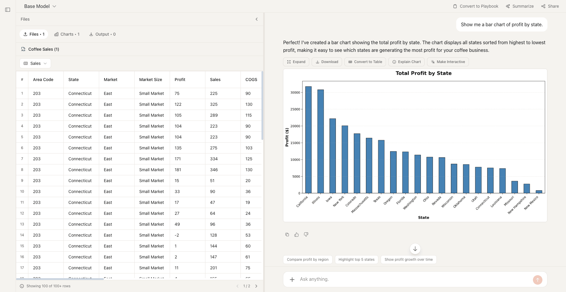
Best for: Rankings, category comparisons, survey responses, and values with long labels.
Avoid when: The horizontal axis represents continuous numeric ranges; use a histogram instead.
2. Double bar graph
Places two bars beside each category so two groups can be compared on the same scale.
Best for: Before-and-after results or two groups across the same categories.
3. Stacked bar chart
Stacks subgroups within each bar to show both the total and its composition.
Best for: Comparing totals while retaining a small number of component categories.
4. Radar chart
Plots multiple measures on axes radiating from a center to create a performance profile.
Best for: Comparing a few items across three to eight measures with similar scales.
5. Pareto chart
Combines descending bars with a cumulative-percentage line to highlight the largest contributors.
Best for: Prioritizing defects, complaints, or causes using the 80/20 principle.
Charts for showing change over time
Use these charts when sequence matters and you want to reveal trends, cycles, or cumulative change.
Line graph
A line graph connects ordered values to reveal direction, rate of change, seasonality, and turning points.
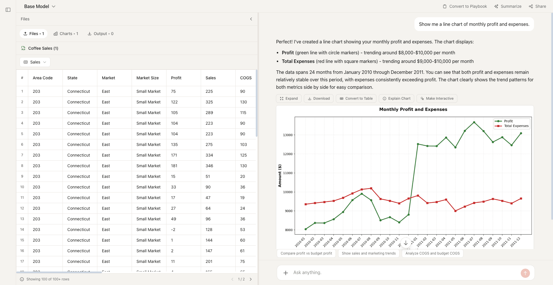
Best for: Time series, trends, forecasts, and comparisons between a few continuous series.
Avoid when: The categories have no natural order or there are too many overlapping lines.
Area chart
An area chart fills the space beneath a line, emphasizing the magnitude of change as well as the trend.
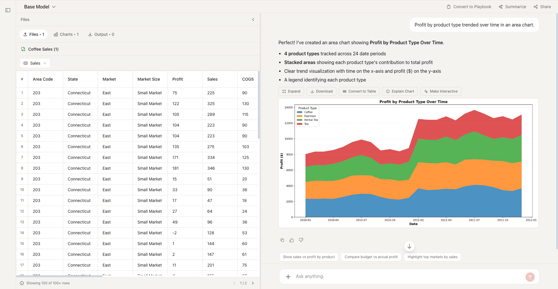
Best for: Showing volume or cumulative change over time with one or two series.
Avoid when: Several filled series overlap and hide one another.
8. Stacked area chart
Stacks filled time series to show how several components contribute to a changing total.
Best for: Part-to-whole trends with a small number of stable categories.
9. Step line chart
Uses horizontal and vertical segments to show values that remain constant until a discrete change.
Best for: Pricing tiers, inventory levels, rates, and state changes.
10. Spline chart
Uses a smoothed curve to present an ordered series with a softer visual flow.
Best for: Presentation-focused trend displays where the overall pattern matters.
11. Calendar heatmap
Colors calendar cells by value to reveal daily patterns, streaks, and seasonality.
Best for: Daily activity, attendance, contributions, or operational volume.
12. Waterfall chart
Shows how sequential positive and negative changes bridge a starting value to a final total.
Best for: Budget variance, profit bridges, cash flow, and headcount changes.
Charts for understanding distributions
Use these charts to see how numeric values are spread, centered, grouped, or affected by outliers.
Histogram
A histogram groups continuous numeric values into bins so you can see the shape, center, and spread of a distribution.
Best for: Response times, ages, order values, test scores, and other continuous measurements.
Avoid when: You are comparing named categories; use a bar chart instead.
Bell curve
A bell curve represents a normal distribution, with most values near the mean and fewer values toward either tail.
Best for: Normally distributed measurements, probability bands, standardized scores, and process variation.
Avoid when: The observed data is skewed, multimodal, categorical, or not approximately normal.
Box plot
A box plot summarizes a distribution through its median, quartiles, range, and potential outliers.
Best for: Comparing several distributions side by side without showing every observation.
Avoid when: The audience needs to see clusters, multiple peaks, or the exact distribution shape.
16. Density plot
Shows a smoothed estimate of a continuous distribution rather than fixed histogram bins.
Best for: Comparing distribution shapes or revealing multiple peaks.
17. Frequency bar graph
Counts how often distinct values or categories occur and displays those counts as separated bars.
Best for: Discrete values, categories, ratings, and survey-answer frequencies.
Charts for finding relationships
Use these charts to look for correlation, clustering, patterns, and interactions between variables.
Scatter plot
A scatter plot positions observations using two numeric variables to reveal correlation, clusters, and outliers.
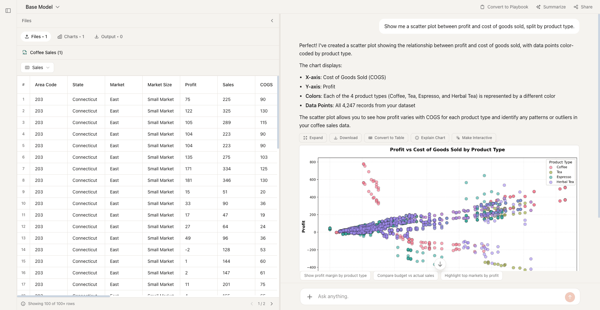
Best for: Testing whether two measurements move together and spotting unusual observations.
Avoid when: One axis contains unordered categories or overlapping points make the pattern unreadable.
Heatmap
A heatmap uses color intensity across a matrix to expose high and low values, patterns, and correlations.
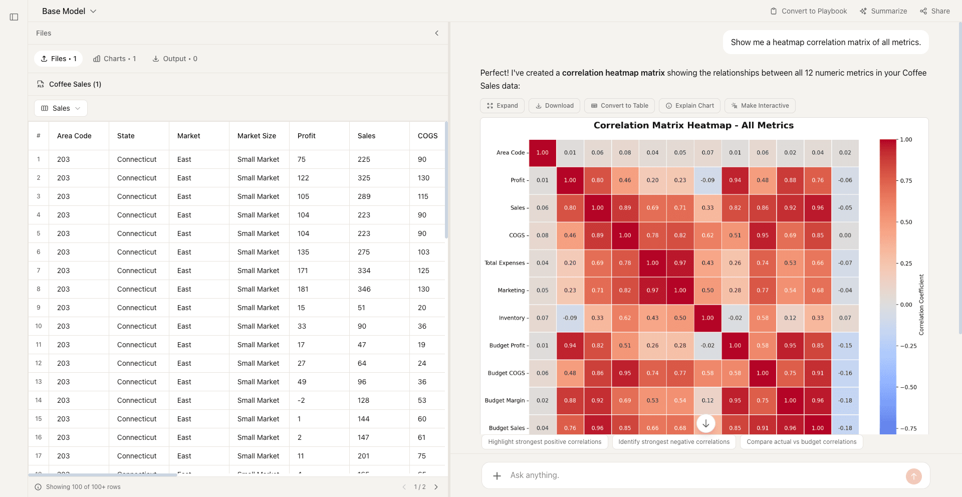
Best for: Correlation matrices, activity by day and hour, and dense comparisons across two dimensions.
Avoid when: Readers must retrieve exact values or the color scale cannot be interpreted consistently.
20. Bubble chart
Adds bubble size to a scatter plot so a third numeric variable can be compared.
Best for: Portfolio analysis and relationships involving three numeric measures.
21. Combo chart
Combines chart forms, usually bars and a line, to compare related measures with different roles.
Best for: Actual versus target, volume versus rate, or totals alongside a trend.
Charts for showing composition
Use these charts to explain how individual parts contribute to a whole or fit within a hierarchy.
Pie chart
A pie chart divides a whole into slices, making the largest and smallest shares easy to recognize.
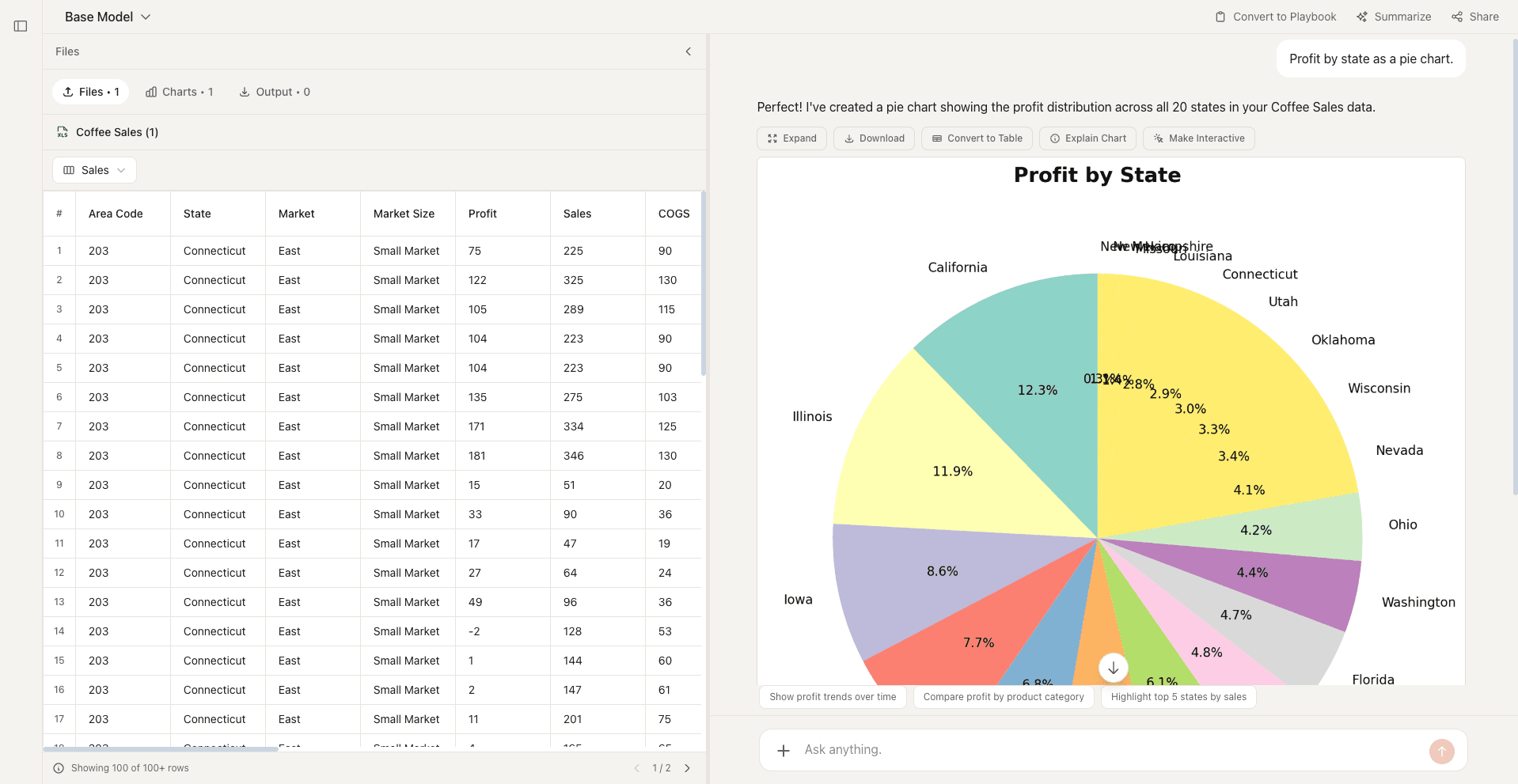
Best for: A single total split into two to five clearly different categories.
Avoid when: There are many slices, similar values, negative numbers, or totals that do not equal a whole.
23. Donut chart
A pie-style chart with a central opening that can hold a total or key label.
Best for: Simple part-to-whole summaries in dashboards.
24. Treemap
Uses nested rectangles to display hierarchical categories, with area representing magnitude.
Best for: Large part-to-whole hierarchies where ranking matters more than exact values.
25. Polar area chart
Uses equal-angle circular sectors whose radii change with the values.
Best for: Cyclical categories or visually emphasizing differences around a circle.
Charts for flows, processes, and plans
Use these charts to map movement, stages, dependencies, or work scheduled across time.
Gantt chart
A Gantt chart places tasks on a timeline so durations, overlaps, milestones, and dependencies are visible.
Best for: Project schedules, launch plans, dependencies, and resource coordination.
Avoid when: The project changes constantly or the main question is process logic rather than timing.
27. Sankey diagram
Uses proportional bands to show quantities moving between sources, stages, and destinations.
Best for: Customer journeys, budgets, energy flows, and material movement.
28. Funnel chart
Shows counts or rates narrowing through consecutive stages in a process.
Best for: Sales, recruiting, onboarding, and conversion pipelines.
29. Flow chart
Uses connected shapes to explain process steps, decisions, and branching paths.
Best for: Procedures, decision logic, approval paths, and troubleshooting.
Charts for geographic data
Use these charts when location is part of the question and regional patterns matter.
30. Choropleth map
Shades defined geographic regions according to a normalized value.
Best for: Rates, percentages, or per-capita measures across states, counties, or countries.
31. Geo map
Places points, symbols, or values at specific geographic locations.
Best for: Store locations, incidents, deliveries, and geographic clusters.
Charts for financial markets
Use these charts to display open, high, low, and close prices across trading periods.
32. Candlestick chart
Encodes open, high, low, and close values as candle bodies and wicks for each trading period.
Best for: Reading price direction, volatility, and trading patterns.
33. OHLC chart
Uses vertical ranges and side ticks to display open, high, low, and close prices.
Best for: Compact technical analysis of market price movement.
How to choose the right chart
- Step 1Define the questionWrite the decision or comparison the chart must make easier.
- Step 2Check the data typeSeparate categories, continuous measurements, dates, locations, and process stages.
- Step 3Choose the simplest matchStart with a bar, line, histogram, or scatter plot before reaching for a specialized chart.
- Step 4Remove unnecessary encodingAvoid extra colors, dimensions, dual axes, and decoration that do not answer the question.
- Step 5Test the takeawayAsk someone to describe the main finding without additional explanation.
- Step 6Label the evidenceUse a clear title, units, scale, legend, and source so the chart can stand on its own.
Formula Bot AI charts
Turn your data into charts with Formula Bot
Upload your data, generate the right chart, ask follow-up questions, and refine the visualization in plain English.
No credit card required. Free plan included.